Logo Review: Uber just made a lot of people unhappy
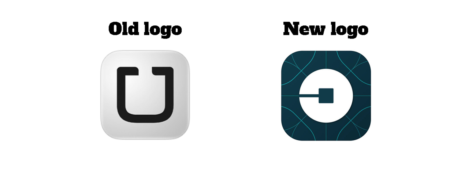
Uber changed its logo on Tuesday in a bid to reflect how different a company they are by launching an unrecognisable logo.
CEO and Co-Founder Travis Kalanick said: “Have you ever looked at someone’s hairstyle and thought ‘Oh my, you peaked in the 1990s?’ Well that’s a bit how I feel about Uber’s look today.”
As a result the company has ditched the old, recognisable U to create a weird pacman-ish looking backwards ‘c’ on a pattern vaguely representing something technologically blue/green and futuristic.
If you thought the logo was weirder than a bad hairstyle, the reasoning behind it is event better with Kalanick saying: “It celebrates our technology, as well as the cities we serve.”
Senior designer Here and Now 365 Tala Temsah said: “While the old Uber logo wasn’t groundbreaking the ‘U’ looked more like Uber making it easy for people to relate to it. The new logo just looks strange – from the pattern to the colours used the new icon is not even reminiscent of the old logo creating a disconnect with the brand.”
Next time you want to order an Uber, you may need to scroll through all your apps to find a weirdly inverted ‘c’ instead of the easily identifiable ‘U’.