Google Logo Review
Google! Everyone uses it in all its shapes and forms. It has evolved drastically over the years while conforming to trends. At some point Google had a drop shadow. YES! A drop shadow! Now, the logo looks smooth, smart and modern.
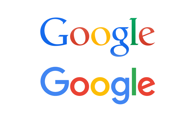
Getting rid of the serifs and the thick and thin strokes within the logo is a very dramatic change.
The old logo gives the impression that this is a search engine. It is very reminiscent of something out of a book or a dictionary. But Google isn’t just a search engine, it also provides maps and directions, email accounts, translation, G+; the list goes on and on. The new logo adapts to all the other apps, showing that Google is not just a search engine, but also a number of other things.
Also, if you look closely, you can see the resemblance between the new and old logo (The angle the G’s stroke is still the same so is the e).
I think it’s really smart how they incorporated the colours of the logo (red, yellow, green, blue) into the G to make it an icon by itself.
We don’t know about you, but we think it is a step in the right direction for Google and we really like it!
By Tala Temsah, Graphics Designer, Here and Now 365
Till date, Google’s logo has been very lean and simple but things have changed a bit now. The new CEO of Google has brought in a new logo which is bold and would work perfectly on all platforms.
With Google, all you need to do is “ASK?”, be it a search engine website, maps, email, etc. Its basic function is to make life easier for its users and provide anything and everything. The new logo launch is just an add-on to the clearer and faster communication provided by Google.
This logo revamp is the most profound till date. The iconic treatment given to “G”, involves a simple yet clever representation of the colours on the “Google” logo by keeping it minimalistic yet modern.
The way the design industry is shaping up to be, Google has done a splendid job with their new logo and we look forward to seeing what they come up with next.
– Nishita Harsora, graphic designer, Here and Now 365
